Boston Bruins Fan Experience
A mobile app concept for Boston Bruins fans focused on making game day easier to follow, more immersive, and more emotionally engaging. The experience centers on score visibility, momentum, player impact, team identity, and fast access to what matters most during and between games.
Overview
The Boston Bruins Fan Experience is a mobile concept designed to help Bruins fans follow games, stay connected to team content, and engage with the broader game day atmosphere in a way that feels fast, focused, and emotionally charged.
While many sports apps provide scores, schedules, and statistics, they often feel generic, league-first, and overly data-heavy. This project explores how a Bruins-focused mobile experience could better reflect how fans actually engage by emphasizing speed, momentum, team identity, and quick access to the moments that matter.
1. Empathize
Understanding Bruins fans
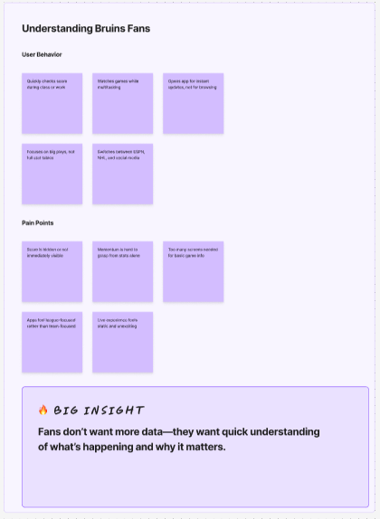
To better understand how hockey fans currently follow their teams, I explored the behaviors and frustrations that shape the mobile sports experience, especially during live games. The goal was to identify what Bruins fans care about most when checking an app quickly and what currently feels missing in existing sports products.
Across this phase, several recurring behavior patterns became clear. Fans often check scores while multitasking during class, work, or other activities. In these moments, they are not looking to browse deeply. They want instant answers.
They also tend to care more about key moments, momentum swings, and standout players than a full wall of statistics. For many fans, the current sports app experience feels functional but not emotionally engaging.
User behaviors
- Checks score quickly during class or work
- Watches games while multitasking
- Opens the app for instant updates, not deep browsing
- Cares about big plays more than full stat tables
- Switches between ESPN, NHL, and social media
Pain points
- Score is sometimes buried under too much content
- Momentum is hard to understand from raw stats alone
- Too many screens are required to get basic game information
- Existing apps often feel league-focused instead of team-focused
- The live experience feels static and not energetic enough
Competitive scan
NHL App
Strong data coverage, but feels too league-heavy and emotionally flat.
Dallas Stars App
Good team branding and fan identity, but the live game experience still feels limited.
Bleacher Report
High urgency and personality with fast updates, but less structured for team tracking and game-focused navigation.
Key insight: Bruins fans do not want more data. They want fast understanding of what is happening and why it matters.
2. Define
Problem statement
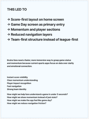
Bruins fans need a faster and more immersive way to understand game status and momentum because many current sports apps prioritize data and navigation over clarity, emotion, and team-first engagement.
Key needs
- Instant score visibility
- Clear understanding of momentum
- Player impact recognition
- Fast navigation between game, team, news, and shop
- Strong Bruins identity throughout the experience
How might we
- How might we help fans understand a game in under 3 seconds?
- How might we show momentum instead of just statistics?
- How might we make the app feel like game day rather than a dashboard?
- How might we reduce navigation friction across core fan tasks?
Design principles
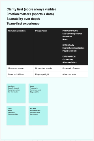
- Clarity first
- Emotion matters
- Scanability over depth
- Team-first experience
3. Ideate
Once the problem was clearly defined, I explored features that could translate those insights into a stronger fan experience. The goal was to organize the app around the moments Bruins supporters care about most, instead of trying to surface everything equally.
Feature brainstorm
Live Game
Score-first layout, momentum section, key moments, top player highlight
News
Trade alerts, recap cards, player updates, game day stories
Shop
Featured jerseys, game day merchandise, fan favorites, product detail flow
Team
Roster, statistics, player spotlight, team identity content
Feature prioritization
- Primary focus: live game experience, game hub, news
- Secondary: momentum visualization, player spotlight
- Exploration: community, advanced stats
Core flows
- Follow Game: Home → Game → Live / Stats / Players
- Check Team: Home → Team → Roster / Stats
- Shop: Home → Shop → Product Details
Information architecture
- Home
- Games
- Team
- News
- Tickets
- Shop
4. Prototype
Mid-fidelity wireframes
Before moving into full visual styling, I translated the concept into mid-fidelity wireframes to focus on structure, hierarchy, and navigation flow. At this stage, the goal was to validate whether users could understand the app quickly without relying on team branding, imagery, or visual polish.
The mid-fidelity direction focused on establishing a score-first experience, reducing clutter, and organizing screens around the moments fans care about most. This stage helped clarify layout priorities such as making the current game immediately visible, grouping related actions into tabs, and keeping navigation team-centered rather than league-centered.
Core wireframe screens included the home experience, game day flow, tickets, news, and team navigation. These layouts helped test whether the fan experience felt fast and scannable before visual identity was layered in.
From mid-fi to high-fi
Once the structural direction felt clear, I moved into high-fidelity design by applying Bruins branding, stronger contrast, and a more expressive visual hierarchy. The transition from mid-fi to high-fi was not about rebuilding the experience, but about strengthening what already worked and making the app feel more immersive, energetic, and team-specific.
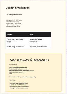
Several key improvements happened during this stage. First, the visual hierarchy became stronger, making important information such as scores, game status, and featured content easier to identify at a glance. Second, the interface gained a much clearer Bruins identity through the use of black and gold, stronger contrast, and more intentional visual emphasis. Third, content that felt structural in mid-fi became more dynamic in hi-fi through trade alerts, featured game-day content, ticket framing, and a more emotional Pro Shop experience.
The high-fidelity phase also helped distinguish different sections of the app more clearly. The live game experience became more focused and readable, the news feed felt more current and urgent, and the Pro Shop became less like a generic store and more like an extension of Bruins culture. Overall, this evolution transformed the product from a functional sports utility into a more premium and engaging game-day companion.
High-fidelity improvements
- Strengthened visual hierarchy so scores, game state, and key content are easier to scan
- Introduced Bruins-specific black and gold branding to create a stronger team identity
- Refined card layouts and spacing to improve clarity and reduce visual clutter
- Added more dynamic content treatment through trade alerts, featured updates, and game-day framing
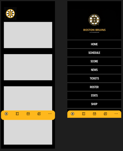
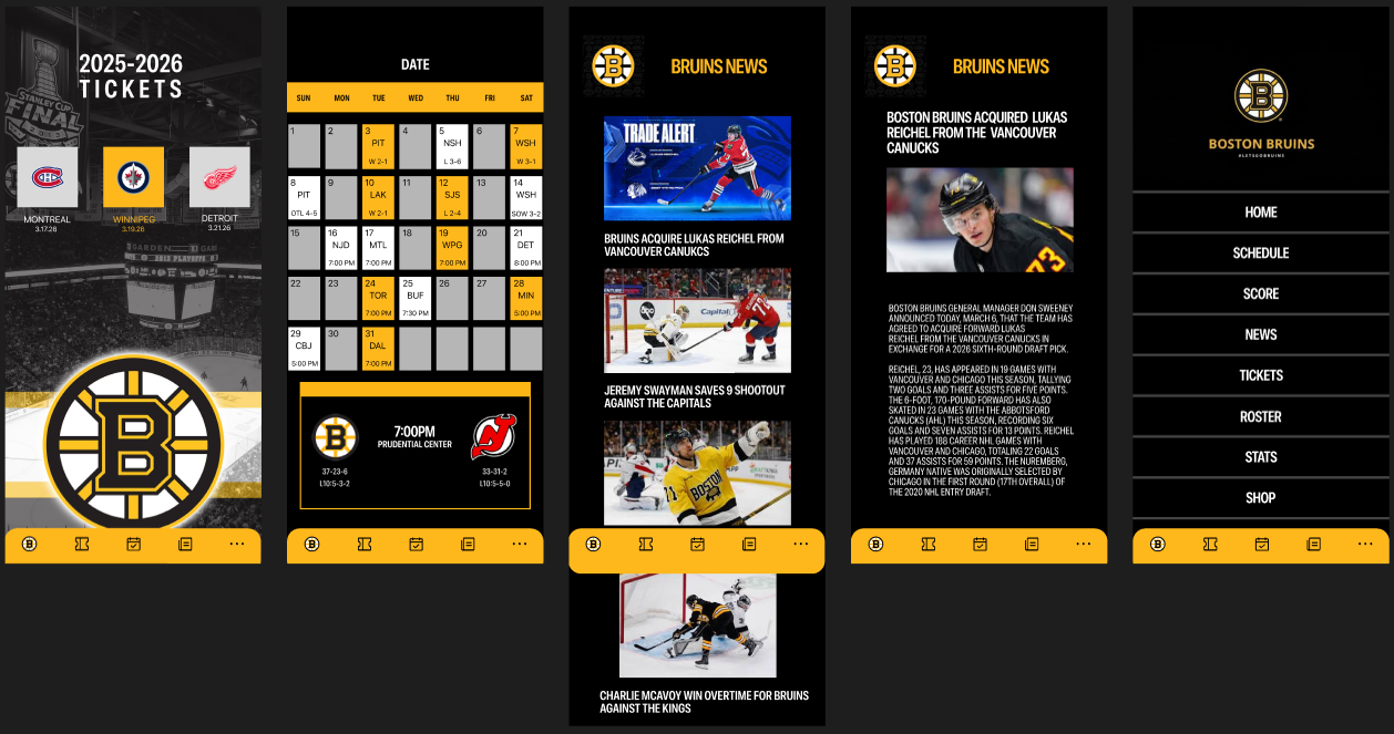
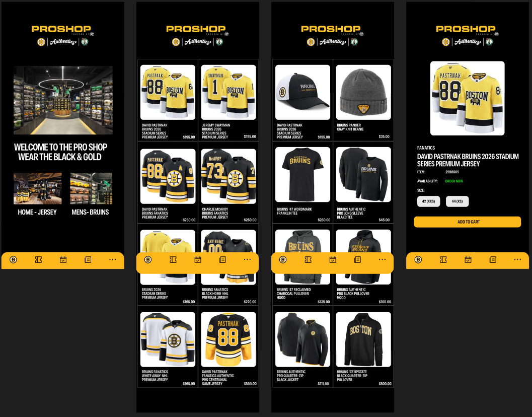
- Made tickets, news, and Pro Shop feel like part of one connected fan experience instead of isolated screens
- Shifted the interface from a clean sports utility toward a more immersive and emotionally engaging product
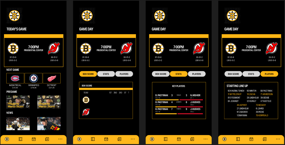
High-fidelity prototype
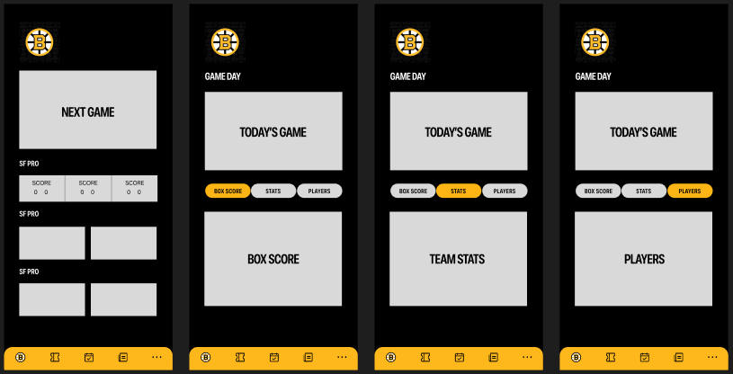
- Large score and matchup framing for instant clarity
- Game hub with score, stats, and players as focused tabs
- News section emphasizing urgency and relevance
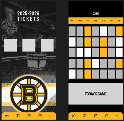
- Tickets and schedule presented as part of the broader game-day experience
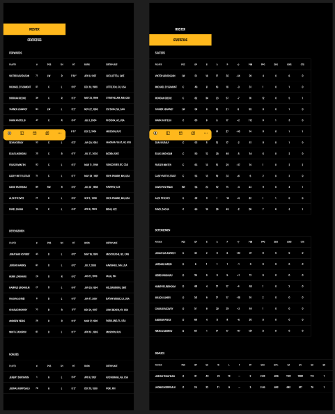
- Roster and statistics views designed for serious team-following behavior
- Pro Shop flow integrated into the same black and gold identity

5. Test
In future testing, the experience would be evaluated around how quickly users can identify game status, move between key areas of the app, and understand momentum without friction.
Test plan
Goal: test whether users can quickly understand the current game and navigate the app without confusion.
Core tasks
- Find the current score
- Identify a top player or key performer
- Find the next game
- Browse a jersey in the Pro Shop
Expected findings
- Users should find the score immediately
- Navigation between game, team, news, and shop should feel intuitive
- Momentum and game progression may need stronger emphasis
- The app should feel more team-specific and emotionally engaging than league-first alternatives
Likely iterations
- Increase score size and visual emphasis
- Strengthen labels such as LIVE or TRADE
- Improve hierarchy on the home screen
- Make momentum more obvious in the game hub
The concept performs best when it focuses on immediate understanding and team-first clarity. The next step would be validating whether the app improves speed, emotional engagement, and game-day identity compared to current sports app patterns.