Cornell Enrollment Mobile App
Cornell’s current Student Center was designed primarily for desktop workflows. However, many students check schedules, add courses, and manage enrollment while moving between classes or using their phones around campus.
This project explores how a mobile-first redesign could improve the enrollment experience by making actions faster, clearer, and less stressful.
The redesign focuses on reducing cognitive load, improving visibility of enrollment status, and guiding students safely through high-risk actions such as adding, dropping, and swapping courses.
Overview
Cornell’s Student Center was built for desktop workflows, yet students often manage enrollment on phones between classes. This project reimagines the enrollment experience as a mobile‑first UX with faster, clearer, and less stressful interactions. It focuses on reducing cognitive load, making status visible, and guiding users safely through add, drop, and swap actions.
1. Empathize
To better understand how students interact with the enrollment system, I conducted informal interviews and walkthrough sessions with Cornell undergraduates during add/drop week.
Participants were asked to describe how they normally add, drop, or swap courses and were observed completing tasks inside Student Center.
Participants
- 6 Cornell undergraduate students
- First‑year to senior
- Majors across engineering, arts, and sciences
Interview observations
Walkthrough sessions with students as they navigated the current enrollment interface.
During these conversations, several patterns emerged.
- Students frequently hesitate before confirming enrollment changes because they are unsure what will happen next. Many re‑read confirmation screens multiple times before pressing confirm.
- The swap feature was often described as confusing or risky, since replacing a course can unintentionally remove a class that students still want to keep.
- Important information such as seat availability, waitlist status, and time conflicts is buried inside dense tables.
- Another common behavior was that students manually double-check their schedule after submitting an enrollment action because they do not fully trust the system feedback.
These observations revealed that the core issue was not only navigation complexity, but lack of confidence during high‑stakes enrollment actions.
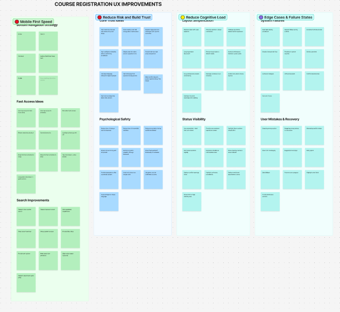
Research synthesis
I translated raw notes into grouped themes to guide design decisions. This helped me prioritize speed, trust during risky actions, reduced cognitive load, and better failure-state handling.
2. Define
Based on the research insights, the main problem became clear.
Students need a faster and safer way to add, drop, and swap classes on mobile devices without feeling uncertain about the outcome of their actions. The current system slows decision-making because it requires navigating multiple pages and interpreting dense tables of information.
Design goals
- Reduce cognitive load – Course information should be presented in scannable layouts rather than large tables of text.
- Increase confidence in risky actions – Students should clearly understand what will happen before confirming enrollment changes.
- Improve mobile navigation – Important actions such as adding, dropping, and swapping courses should be accessible with fewer steps.
- Improve system feedback – The interface should clearly communicate when enrollment actions succeed or fail.
3. Ideate
After synthesizing the research insights, I explored ways to restructure the enrollment experience for mobile use. Brainstorming focused on improving four aspects of the current system:
- reducing cognitive load when scanning course information
- increasing confidence when performing high-risk actions
- improving navigation speed for common tasks
- handling edge cases such as schedule conflicts or prerequisites
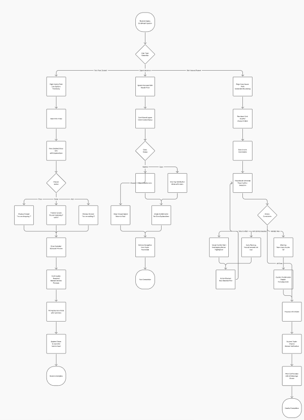
One important concept that emerged was shifting enrollment from a form-based system into a guided workflow. Instead of asking students to navigate complex tables and forms, the redesigned experience would guide them through a step-by-step process for adding, dropping, or swapping classes.
Another idea involved replacing dense course tables with card-based layouts, allowing students to quickly scan course names, seat availability, and class times.
These ideas helped establish the foundation for the wireframe prototypes.
4. Prototype
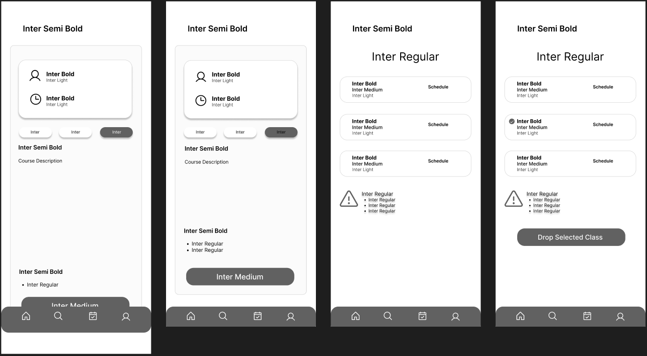
Mid-Fidelity Wireframes
Mid-fidelity wireframes were created to test navigation structure and enrollment flows before moving into visual design. The wireframes focused on several key improvements.
- Clear action hierarchy made common actions such as add, drop, and swap easier to find.
- Step-by-step enrollment flows guided students through each stage of the process.
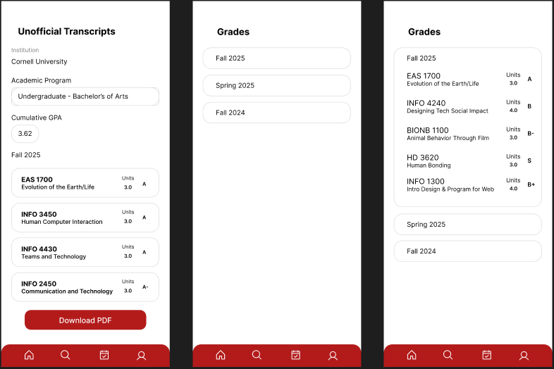
- Course information was organized into card layouts instead of tables to improve scanability.
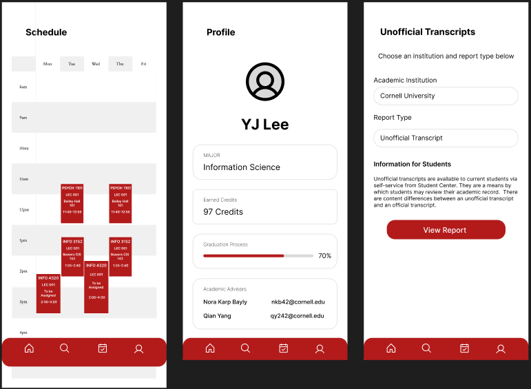
- Seat availability, waitlist status, and schedule conflicts were made more visible.
Key flows designed during this stage included:
- Student Center dashboard
- Adding a course
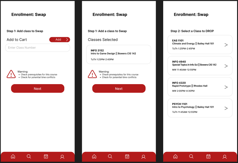
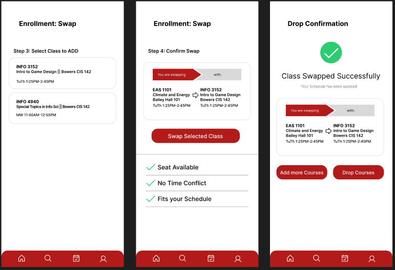
- Swapping a course
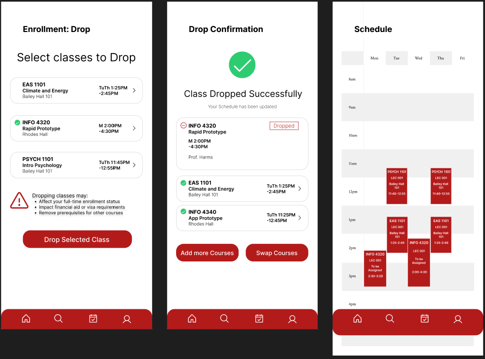
- Dropping a course
- Viewing schedule blocks
These wireframes allowed rapid iteration on layout and interaction patterns before introducing branding and visual styling.
Mid-fidelity exploration
Early wireframes exploring guided enrollment steps, simplified cards, schedule visibility, and strong confirmation patterns.
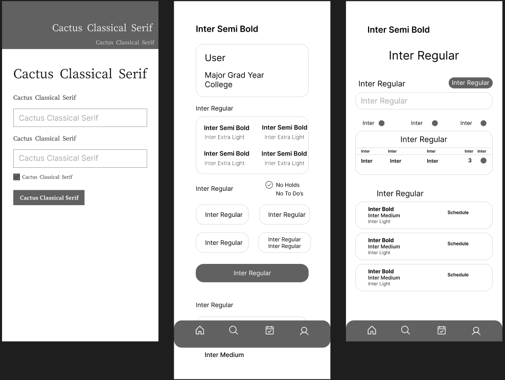
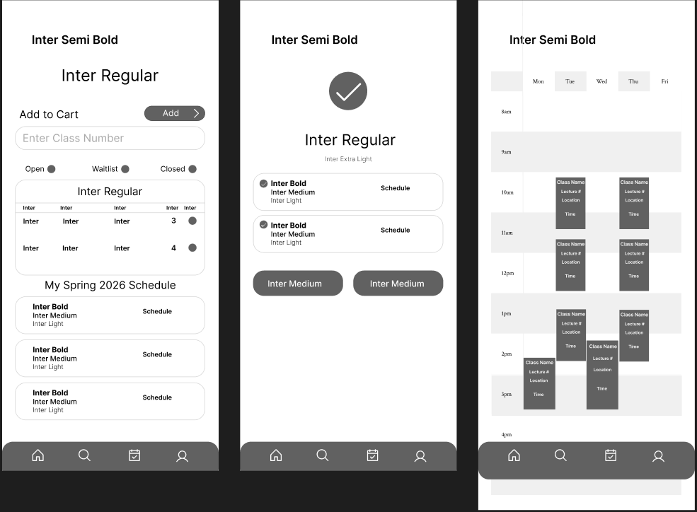
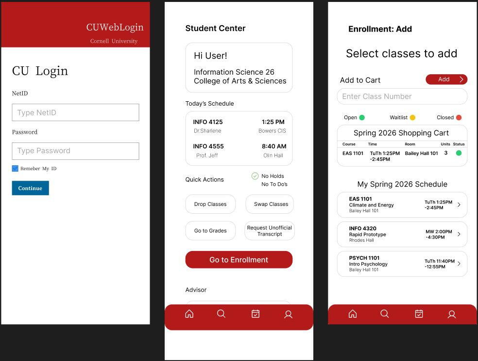
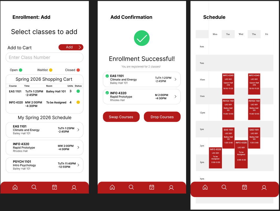
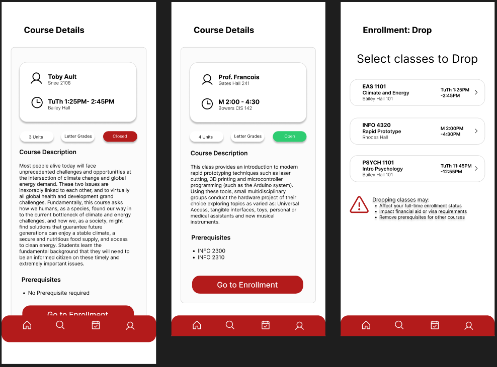
High-Fidelity Design
After validating the enrollment flows through mid-fidelity wireframes, high-fidelity screens were created to refine typography, color hierarchy, and visual clarity.
The final design introduces several improvements.
- Course tables were replaced with card-based layouts that make class information easier to scan.
- Clear status indicators show whether a class is Open, Waitlist, or Closed.
- Guided step-by-step enrollment flows help students safely complete actions.
- Visual schedule blocks allow students to quickly detect time conflicts.
- Stronger confirmation states communicate when enrollment actions succeed.
Cornell’s red color was used as the primary accent to maintain institutional branding while highlighting important actions.
High-fidelity screens
Final mobile designs demonstrating the guided enrollment flow, strong confirmation feedback, and reduced cognitive load.
Testing
To evaluate the usability of the redesigned interface, quick usability testing sessions were conducted with Cornell students. Participants were asked to complete three common tasks using the prototype:
- Add a class
- Swap a class
- Drop a class
Students were able to complete these tasks faster and with less hesitation compared to the current Student Center interface. Participants noted that the swap preview helped them feel more confident about replacing a course. The visual schedule blocks made time conflicts easier to understand. Confirmation screens clearly communicated when enrollment actions were successful.
These results suggest that improving visibility, system feedback, and structured workflows can significantly reduce uncertainty during enrollment.